BACKGROUND
Leading mobile parking platform, but engagement stops at payment

ParkMobile is North America’s leading parking app. After its acquisition by Arrive in 2025, the vision expanded beyond payments toward a more unified mobility experience. Yet most users still interact with the app only briefly, just long enough to pay, leaving a gap between where drivers actually need support and where the product engages them. Our partnership with Arrive explores how the experience can evolve earlier in the parking journey.
average time spent in-app
28 Seconds
supported across North America
700+ Cities
using ParkMobile annually
65M+ Users
HOW MIGHT WE…
Help drivers feel more informed and secure when choosing where to park by addressing concerns around safety and availability and by encouraging earlier engagement in their journey?
final design
Designing for confident parking decisions
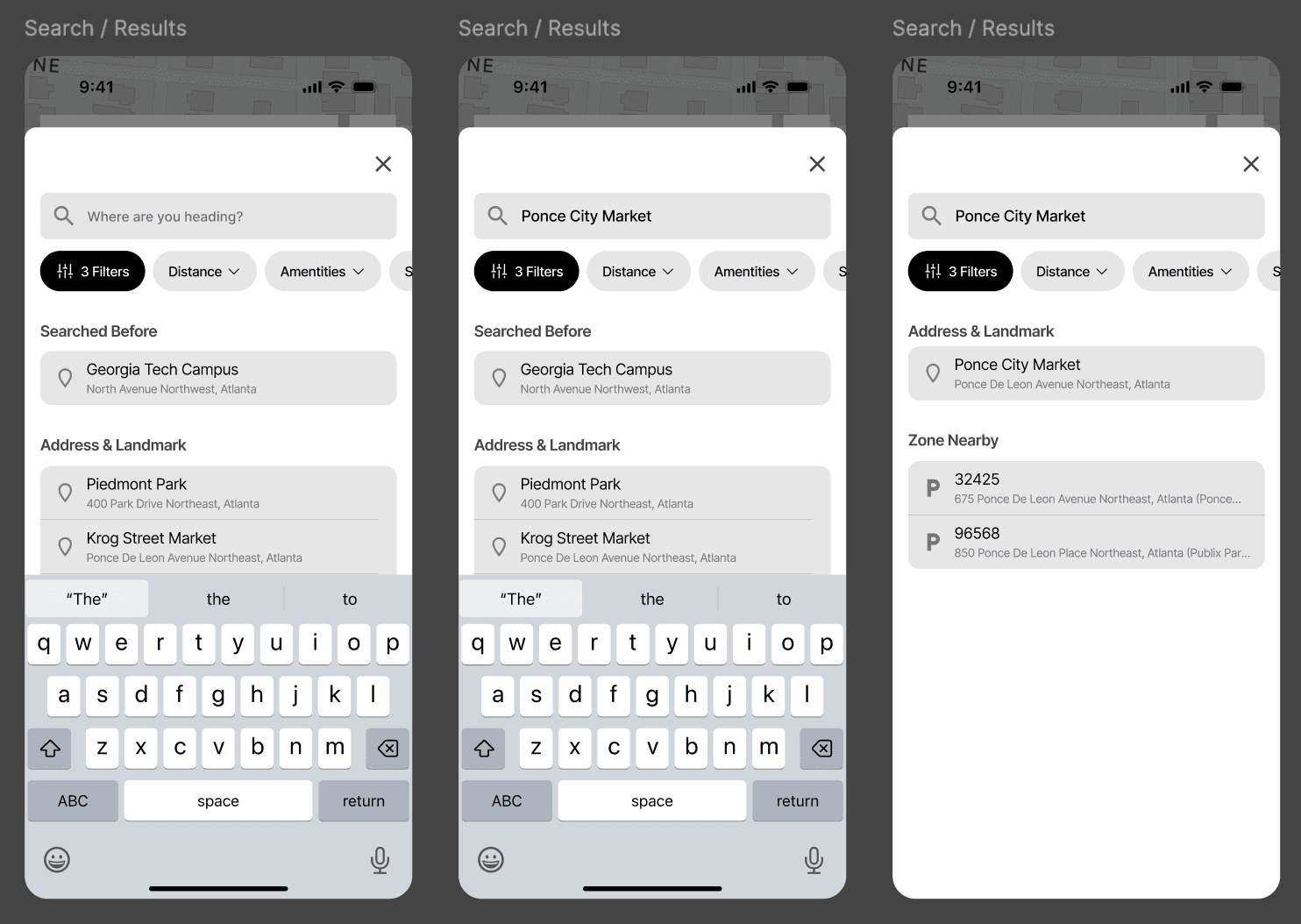
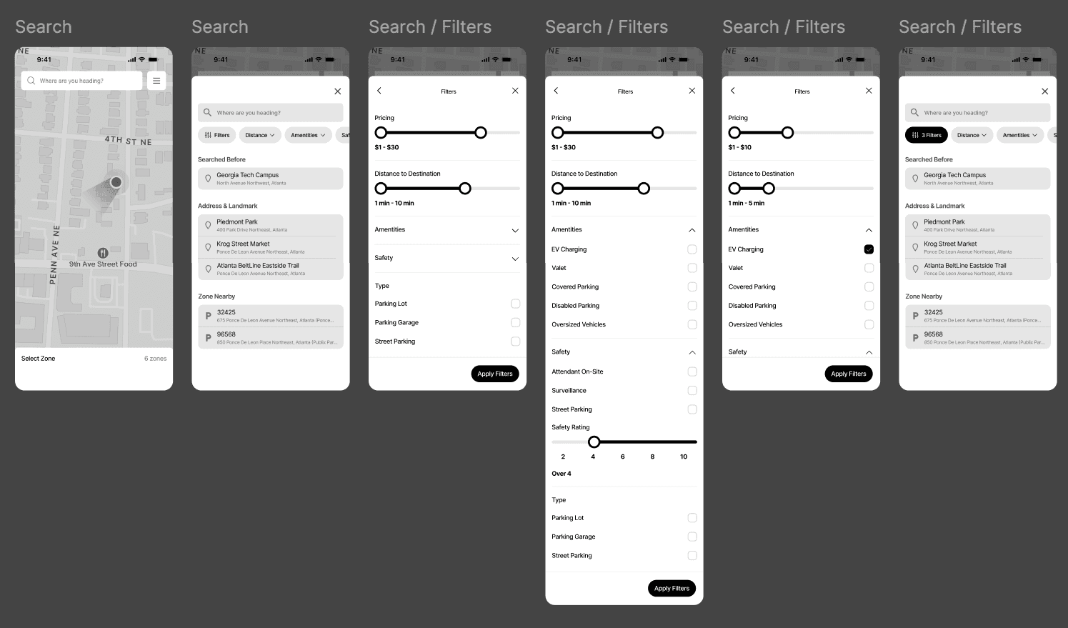
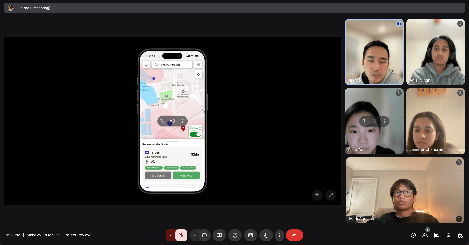
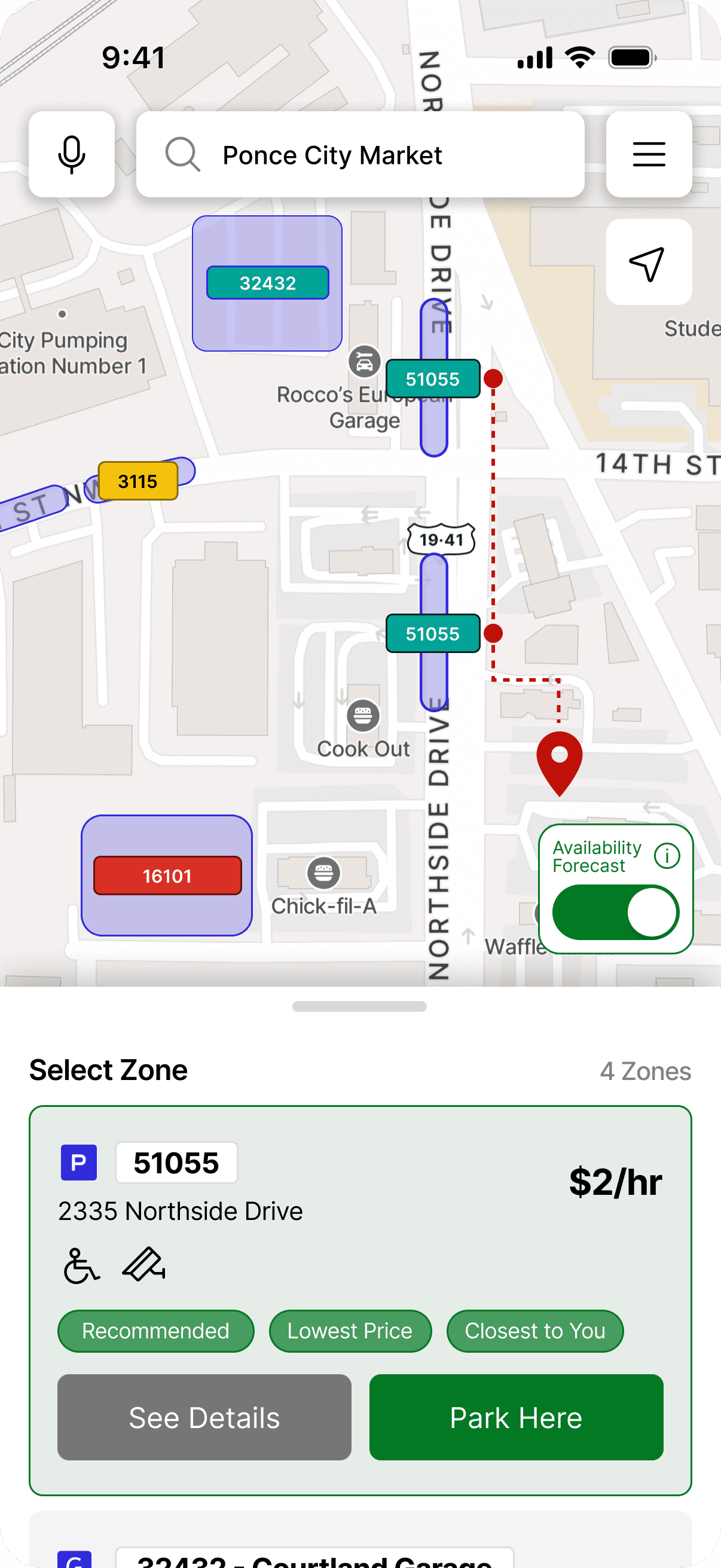
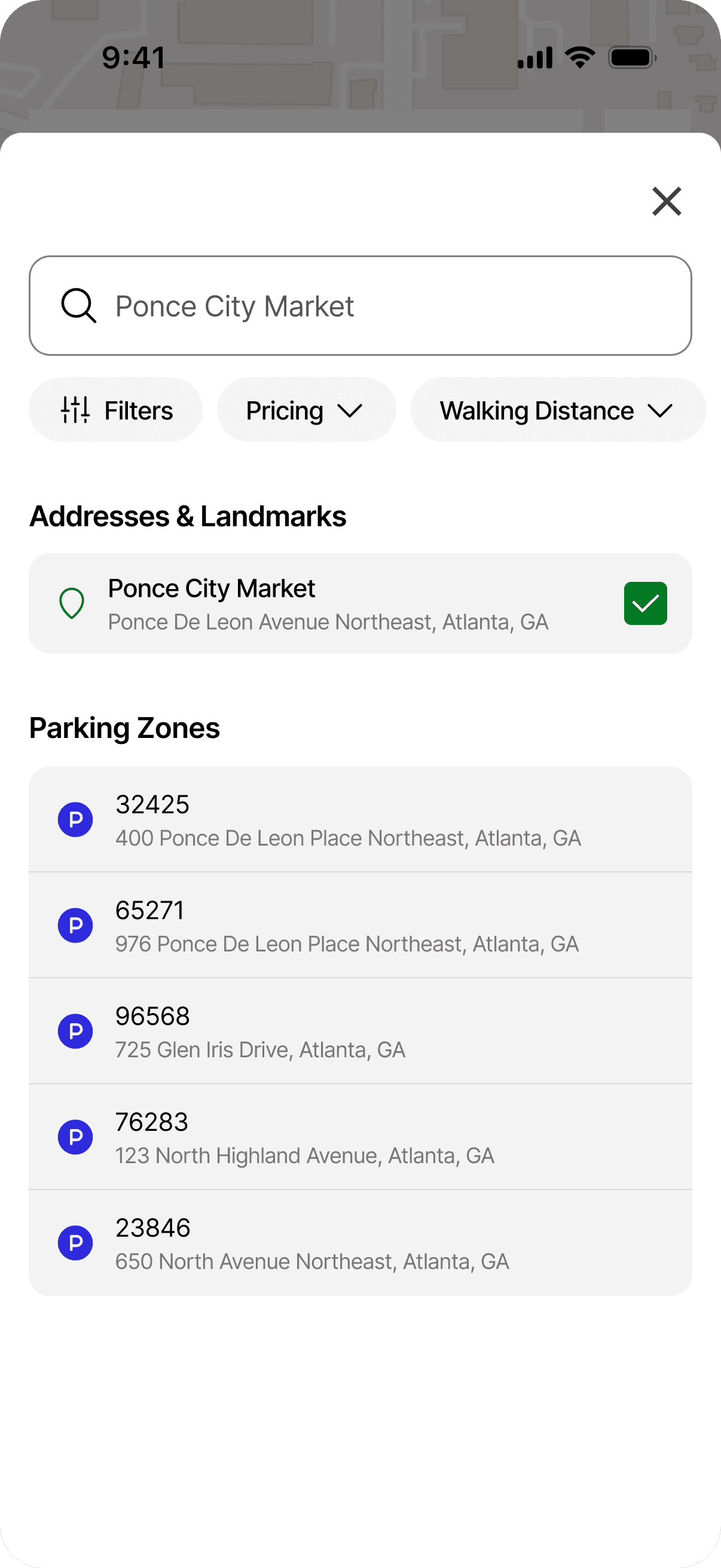
Search & Filtering
Search by destination, landmark, or parking zone, either to explore parking near a destination or quickly access a known parking zone and pay. Refine using filters like walking distance, price, amenities, and safety.
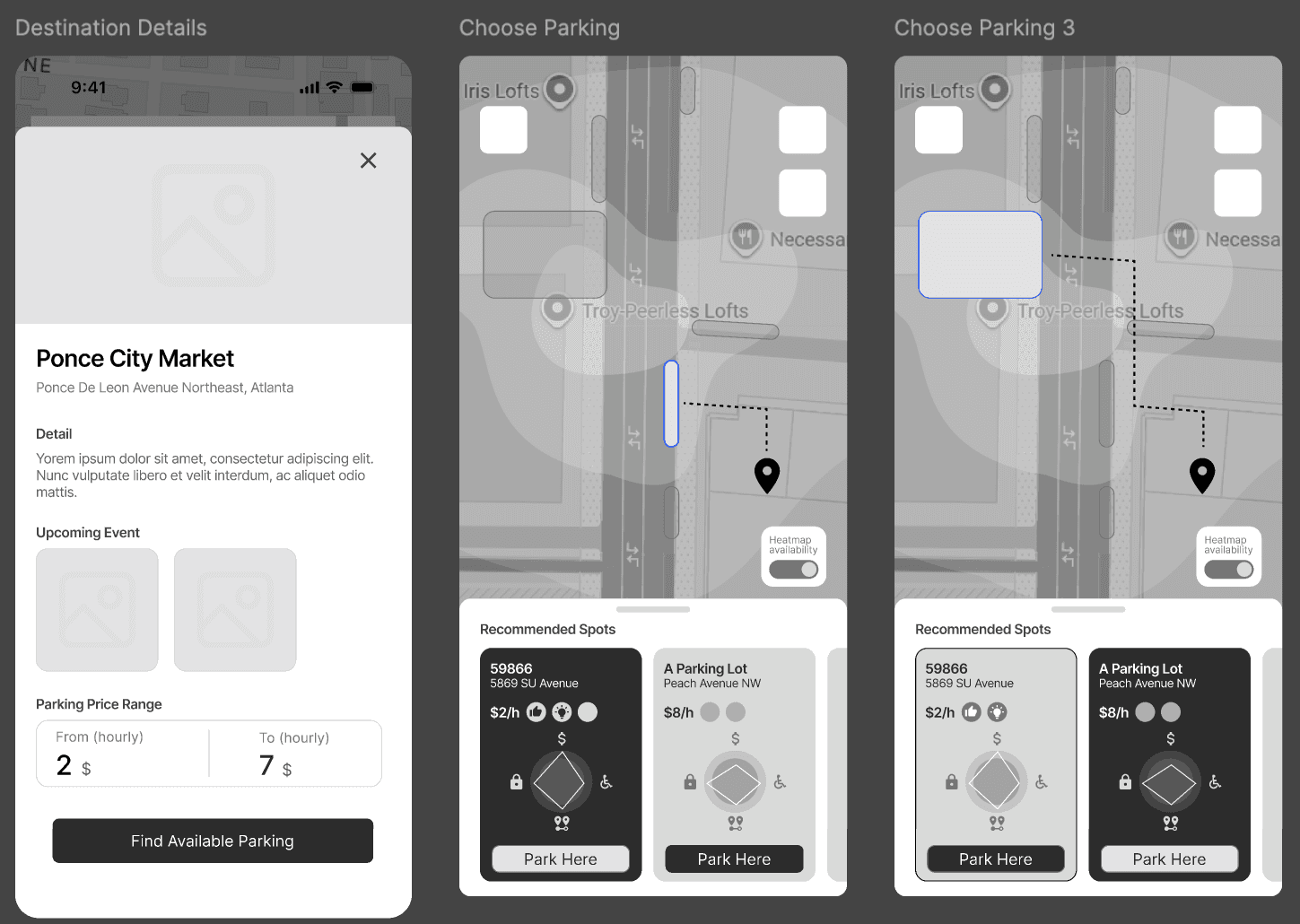
Parking Map & Availability
View predicted availability across an area using a color-coded forecast. Quickly compare zones, understand the likelihood of finding a spot, and view the walking distance from each parking option to the final destination.
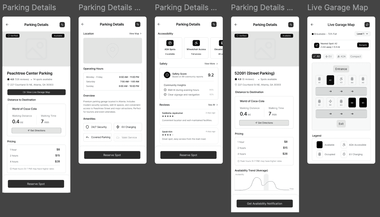
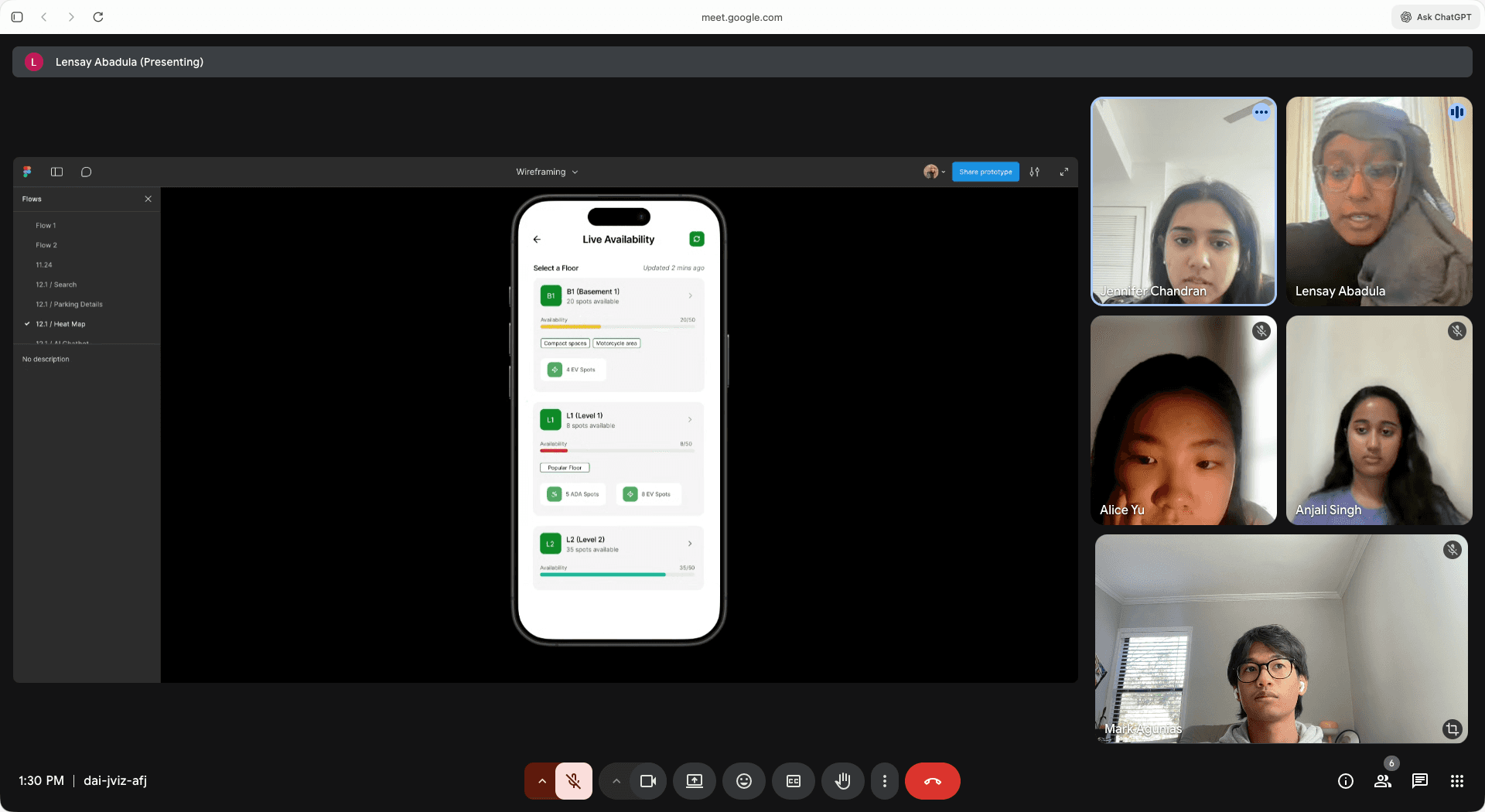
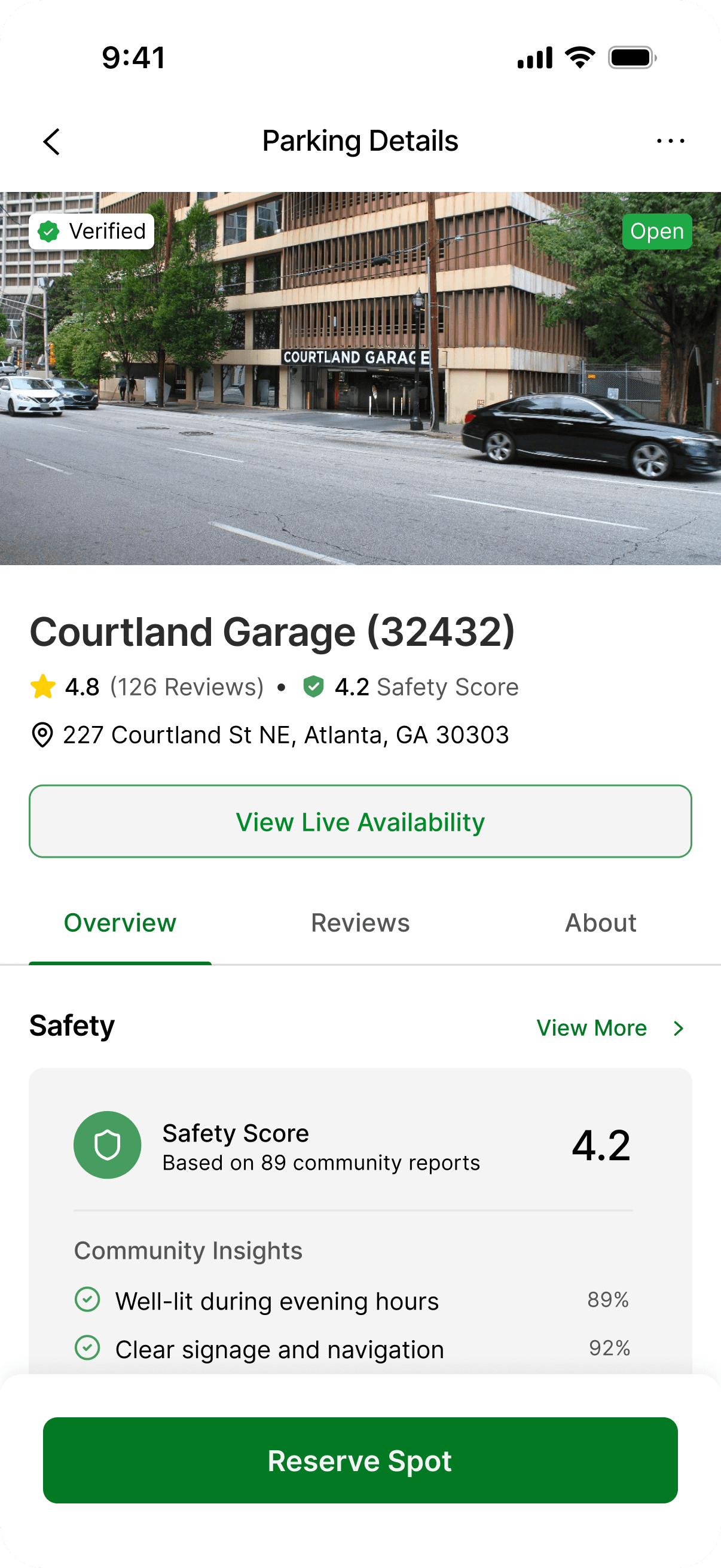
Parking Details & Garage Map
Provide essential information, including distance, pricing, safety score, reviews, amenities, and accessibility features. View live floor-level availability and static garage map to better understand layout and navigation before arriving.
We started by understanding how drivers actually experience parking today.
The parking problem
Urban parking isn’t just inconvenient. It’s inefficient
Parking is one of those everyday problems that quietly affects almost everyone in cities. It’s not just an inconvenience. It wastes time, fuel, and increases congestion. Parking directly affects city revenue, traffic flow, and public transit use. Our goal was to look at why this remains such a stressful experience and how technology could make it more predictable and safe.
82%
of drivers identify parking as their
top urban stressor (ParkMobile, 2023)
the challenge of urban parking
More spaces, but not more certainty
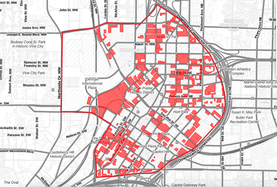
Land area devoted to parking in Downtown Atlanta (highlighted in red)
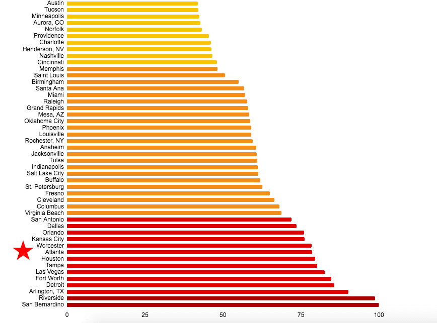
The city ranking bar chart (yellow to red, with Atlanta starred)
42%
average parking occupancy, far below the optimal 85% utilization rate (CAP and ADID, 2014)
400%
increase in parking supply from 18.5K spaces in 1953 to 93K in 2014 (Hurley, 2015)
25%
of downtown land is dedicated to parking, one of the highest among US cities (Urbanize Atlanta, 2024)
Downtown Atlanta is a perfect example: nearly a quarter of downtown land is dedicated to parking. Despite this massive footprint, Atlanta still ranks near the bottom nationally for parking convenience and accessibility. It shows that the issue isn’t about supply. It’s about visibility and usability.
Parking Stress and Behavior Trends
Drivers want predictability and control, not just payment convenience
still try to avoid
parking
of urban spaces underutilized
want a single integrated app
say poor parking
keeps them from
going out
would pay if they could
reserve ahead
88%
75%
85%
66%
84%
ParkMobile Surveys, 2024
Inefficient utilization
Late-stage engagement
Limited transparency
Spaces underused or misallocated
Users only open app to pay
No info on safety or availability
Increased congestion
Lost opportunity for early planning
Low trust and confidence
existing issues and gaps
Why the current experience falls short
These gaps show that while the parking infrastructure exists, the user experience still doesn’t support confident decision-making, thus framing the need for our research.
Challenge
Description
Impact
research
50
survey results
14
semi-structured interviews
1
task analysis
270
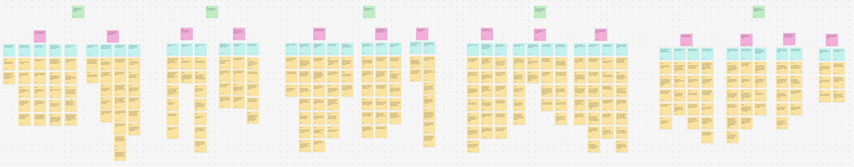
affinity map notes
KEY FINDINGS
We found out that…
1
Spot type matters beyond availability, with perceptions shaped by lighting, enclosure, and whether parking feels exposed or secure.
2
Users are price-conscious, but safety takes priority, even when cheaper options are available.
3
Many drivers plan parking earlier in the journey, rather than treating it as a last-minute decision.
4
Trust is built through concrete details, including lighting, security indicators, hours of operation, and entrance visibility.
5
Drivers adapt their behavior to context, changing strategies based on time, location, and the nature of the trip.
Drivers value distance, price, and safety, but unclear fees and unreliable apps reveal a gap between convenience and trust.
6
App Flow
Why the current app falls short
1
The app assumes parking is already decided, offering little context before selection.
2
Zone selection lacks upfront filters for lot type, safety, or amenities.
3
Landmark search is inconsistent, and the zone model assumes prior knowledge.
4
The web experience provides richer context, but only for reservable inventory.
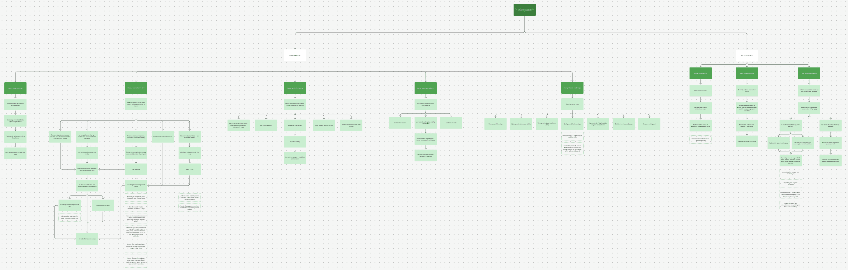
Hierarchical Task Analysis
Different apps, different priorities
Parking apps share a map-first pay flow but differ in depth and intent. ParkMobile and PayByPhone favor speed and transaction, while SpotHero trades simplicity for richer reservation context.

competitive analysis
Drivers don’t think about parking as a simple payment task. It’s a safety and context-driven decision that starts earlier than ParkMobile supports.
WHAT THIS MEANS
Design requirements
Drivers need…
1
Transparency and Value
Offer dynamic pricing insights and best-value highlights. Builds trust and encourages consistent app use.
2
Contextual Awareness
Visualize proximity, lighting, and safety indicators near destination. Supports informed choice.
3
Situational Flexibility
Adapt the interface based on context. Keeps relevance high and reduces friction.
4
Personalization
Remember habits and suggest tailored options. Makes parking feel intuitive and familiar.
5
Pre-Decision Engagement
Introduce “Plan Ahead” mode and pre-trip previews. Expands engagement beyond payment.
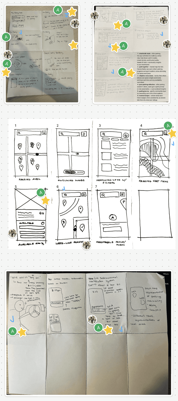
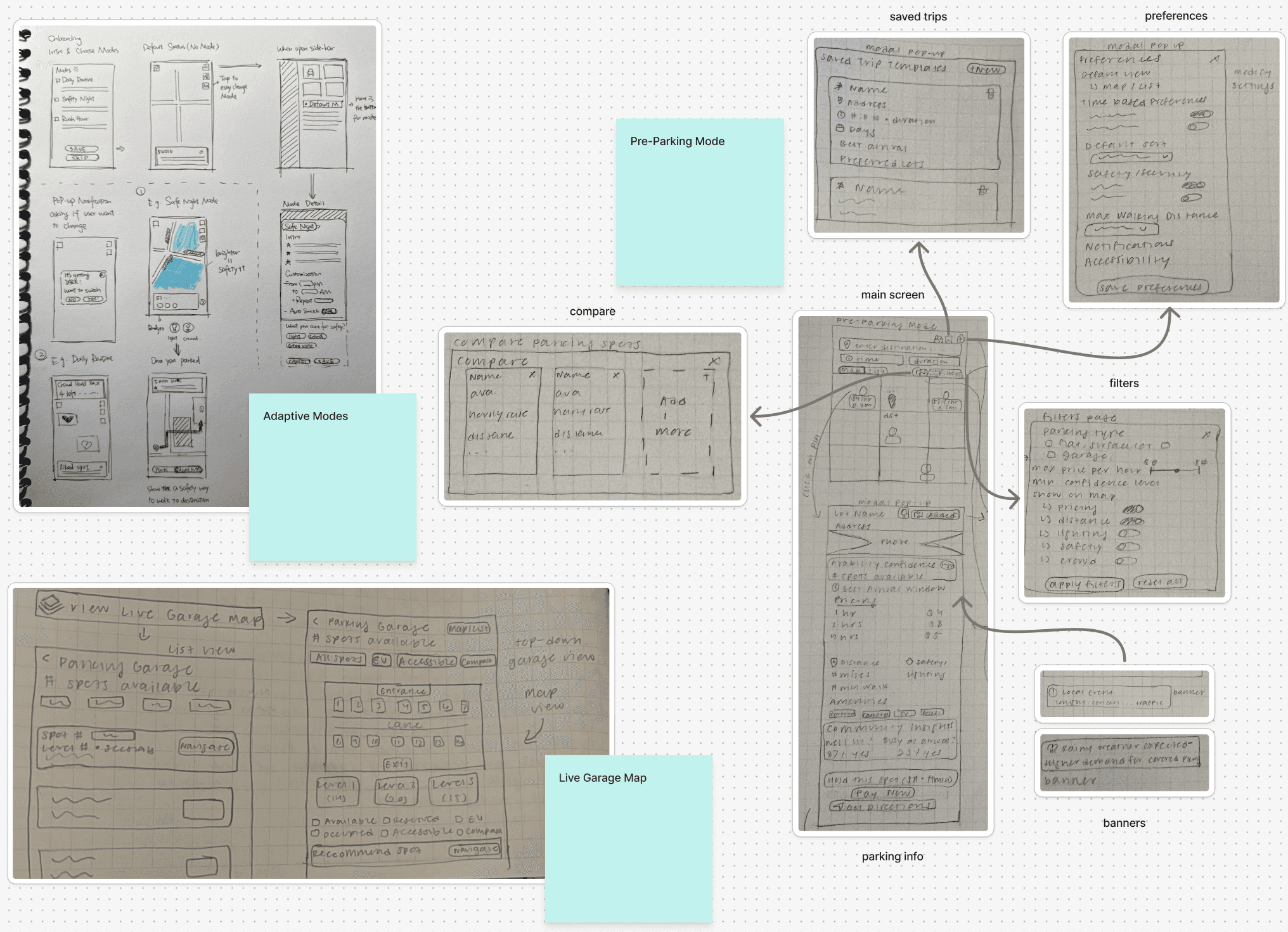
ideation
Lo-Fi Sketches
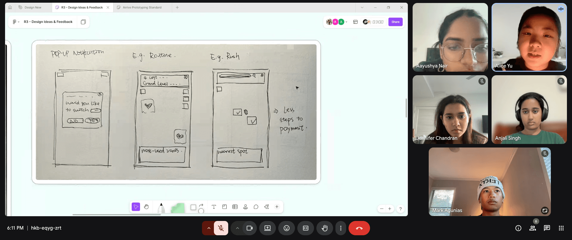
We started by brainstorming around our design implications and ran a Crazy 8s session to get as many directions on paper as possible. After the session, we ended up with three main concepts: Planning Mode, Predictive Parking, and Parking Companion.
Click through the slides below to view each concept sketch:
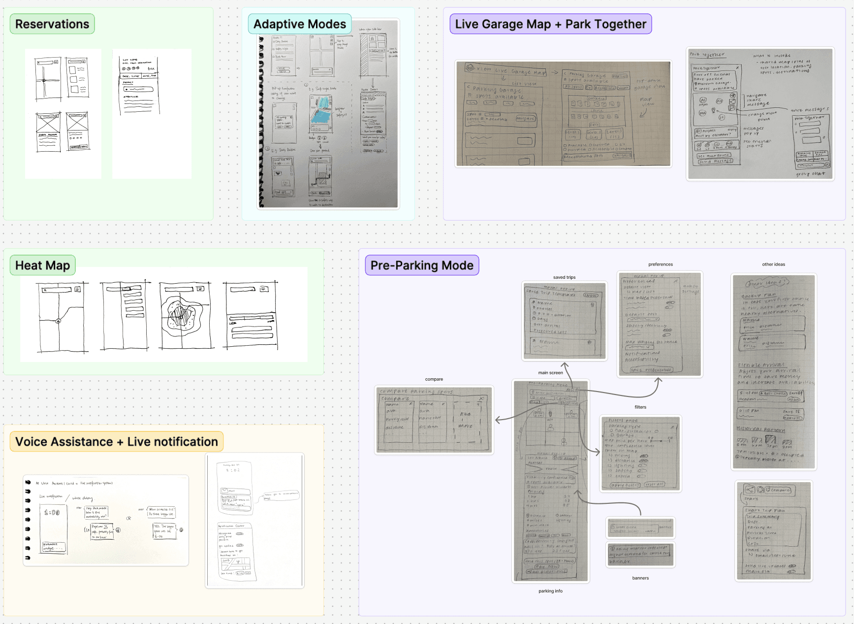
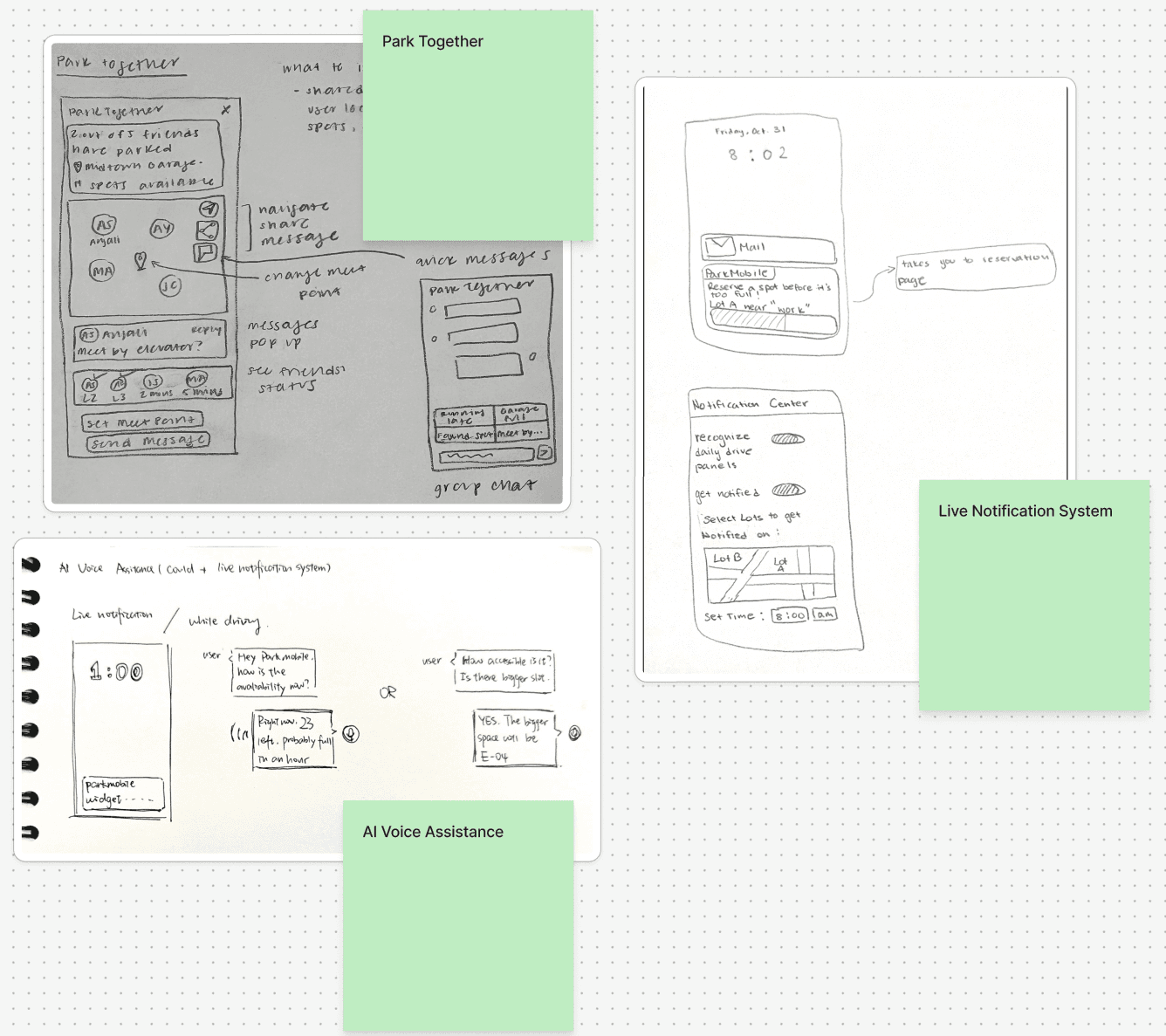
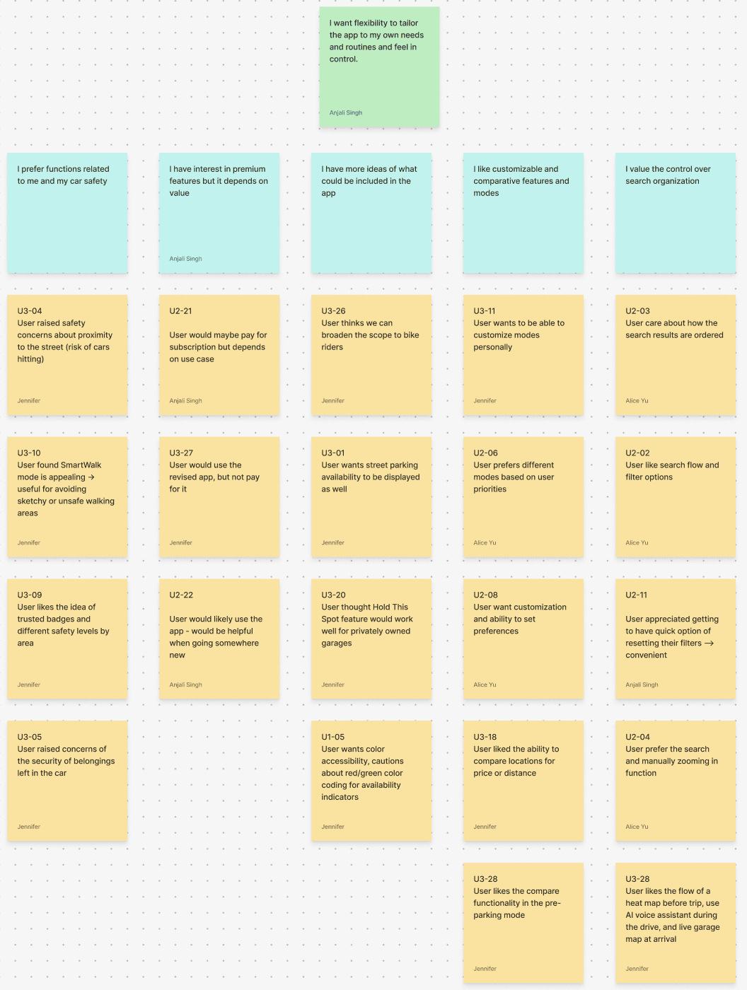
I want flexibility to tailor the app to
my own needs and feel in control.
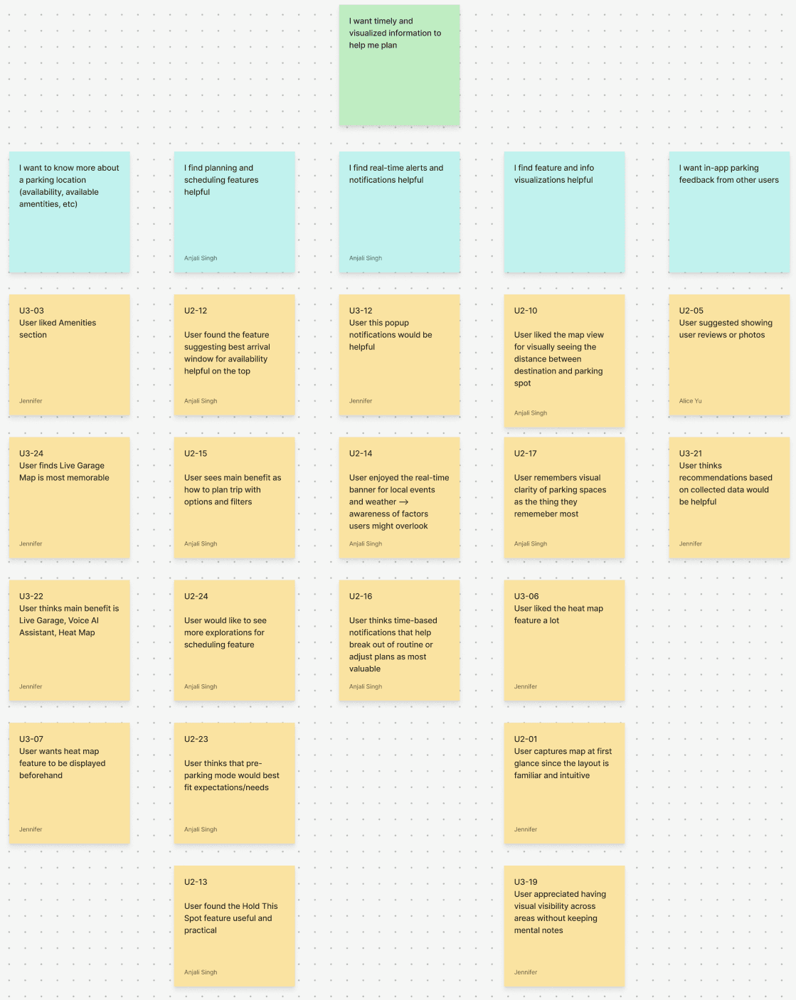
I want timely and visualized information to help me plan.
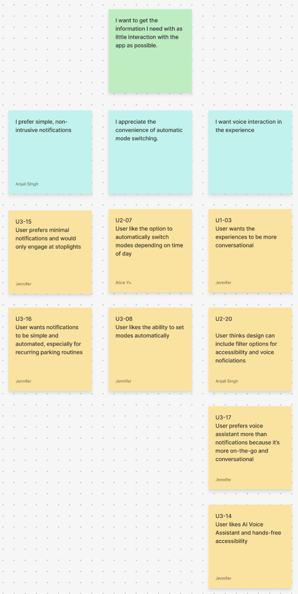
I want to get the information I need with as little interaction as possible.


sketch feedback
Feedback Sessions

Feedback Sessions
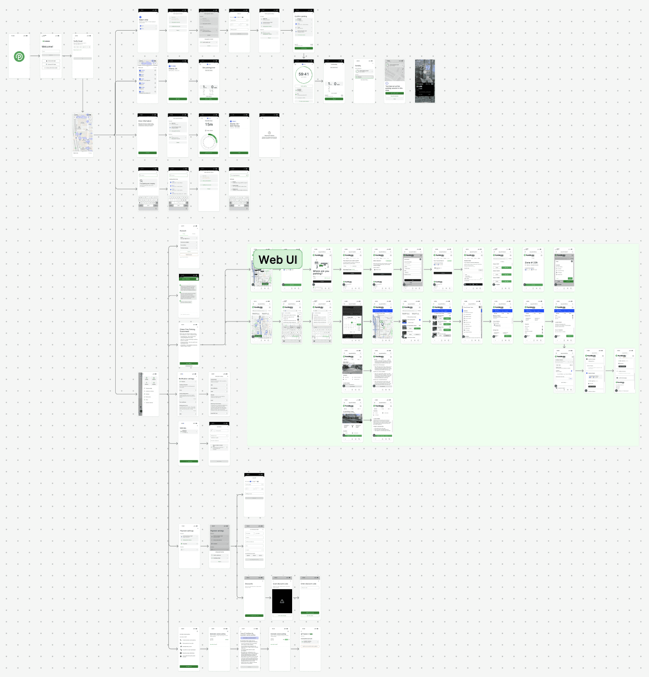
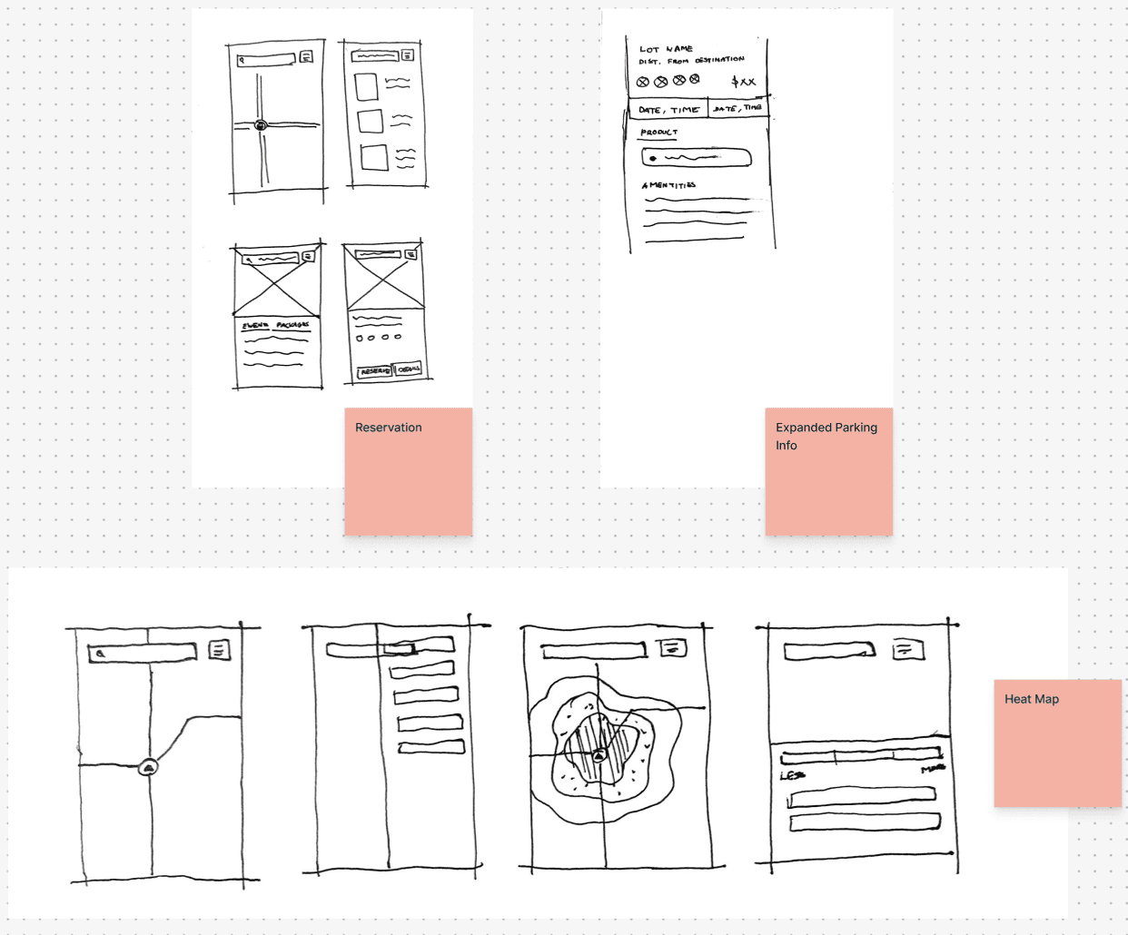
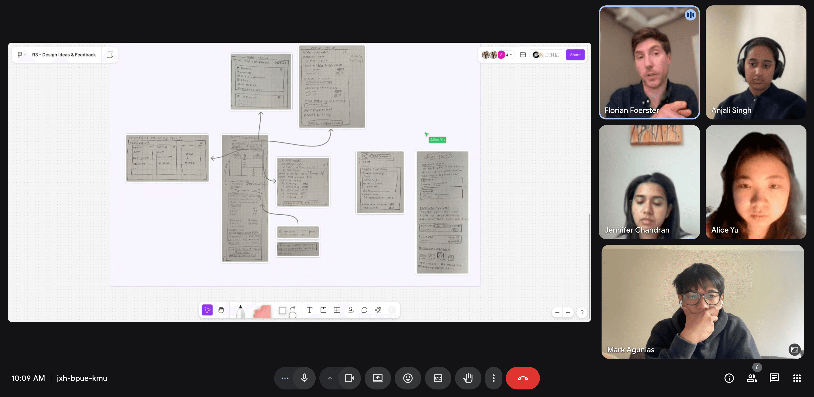
Wireframes
Discovery Experience
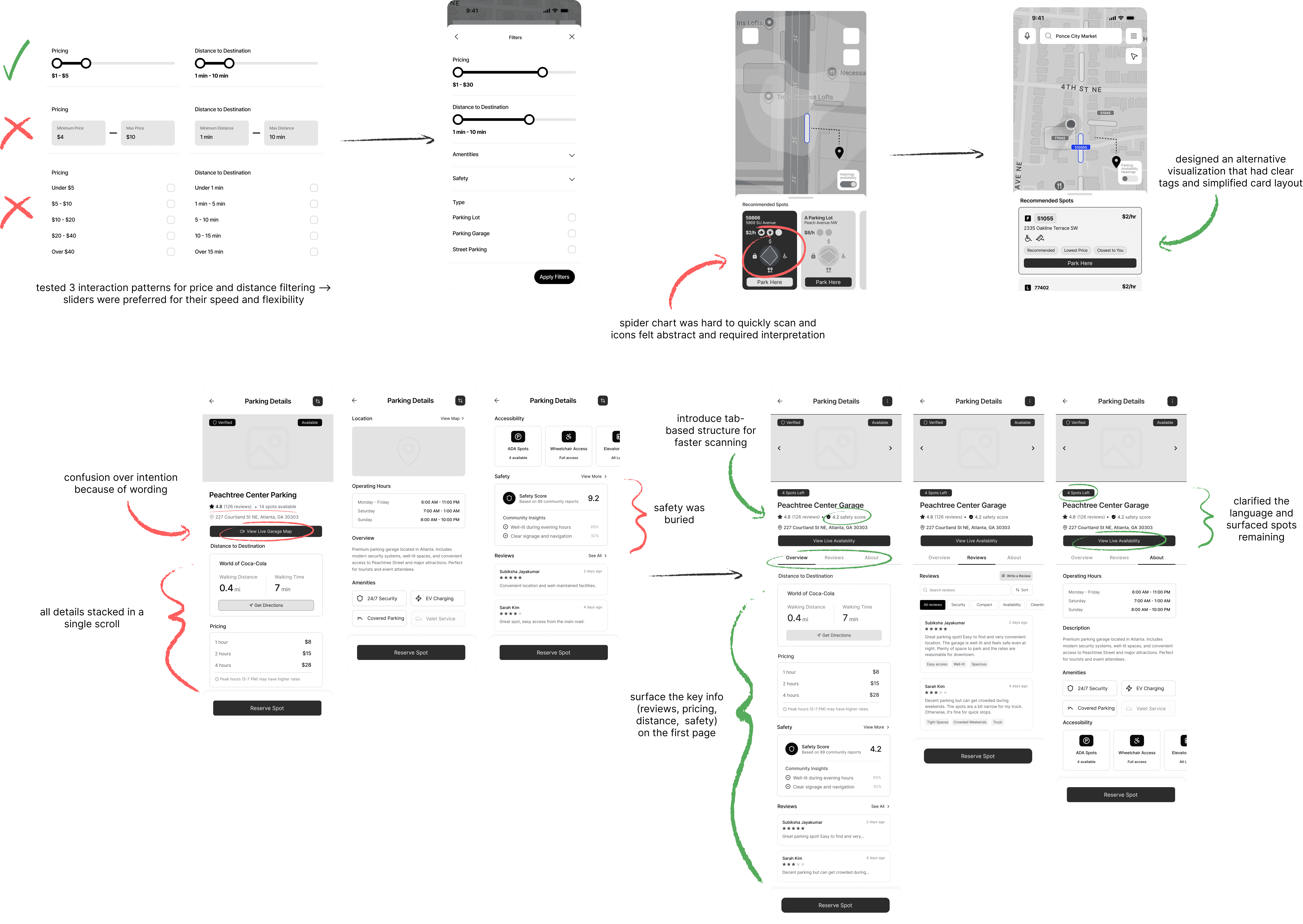
Filters are embedded directly into the search and map view, allowing users to quickly compare options and adapt based on their priorities. Near the destination, a recommendation section visualizes tradeoffs, such as price, accessibility, distance, and safety, using a spider chart, while a predictive heat map provides a broader sense of availability trends, helping drivers feel more confident before committing.
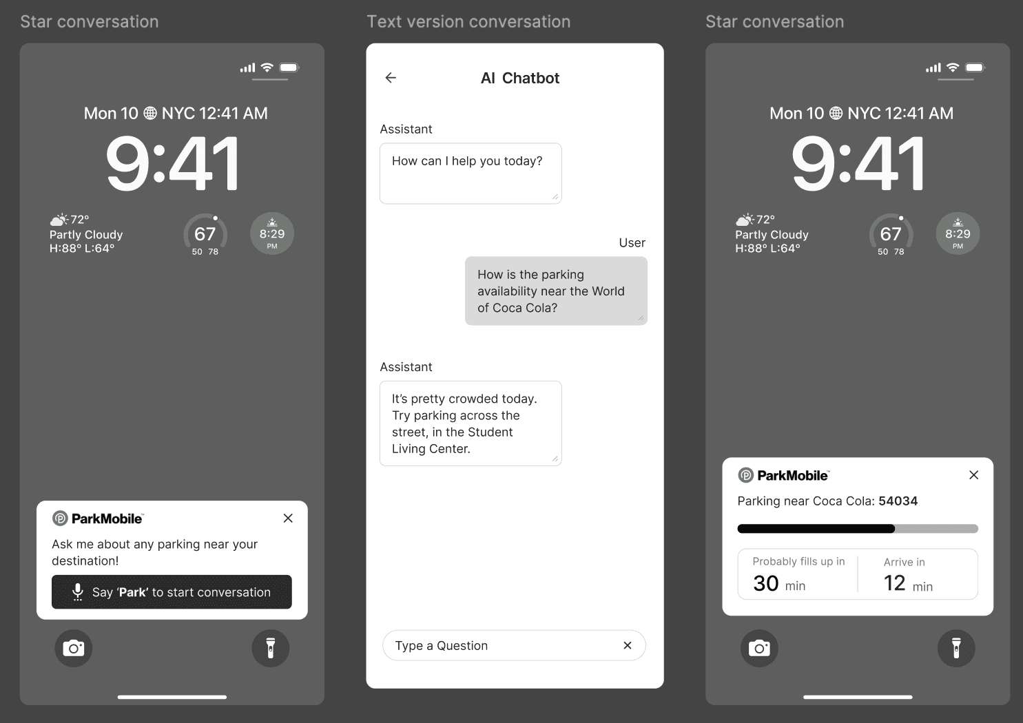
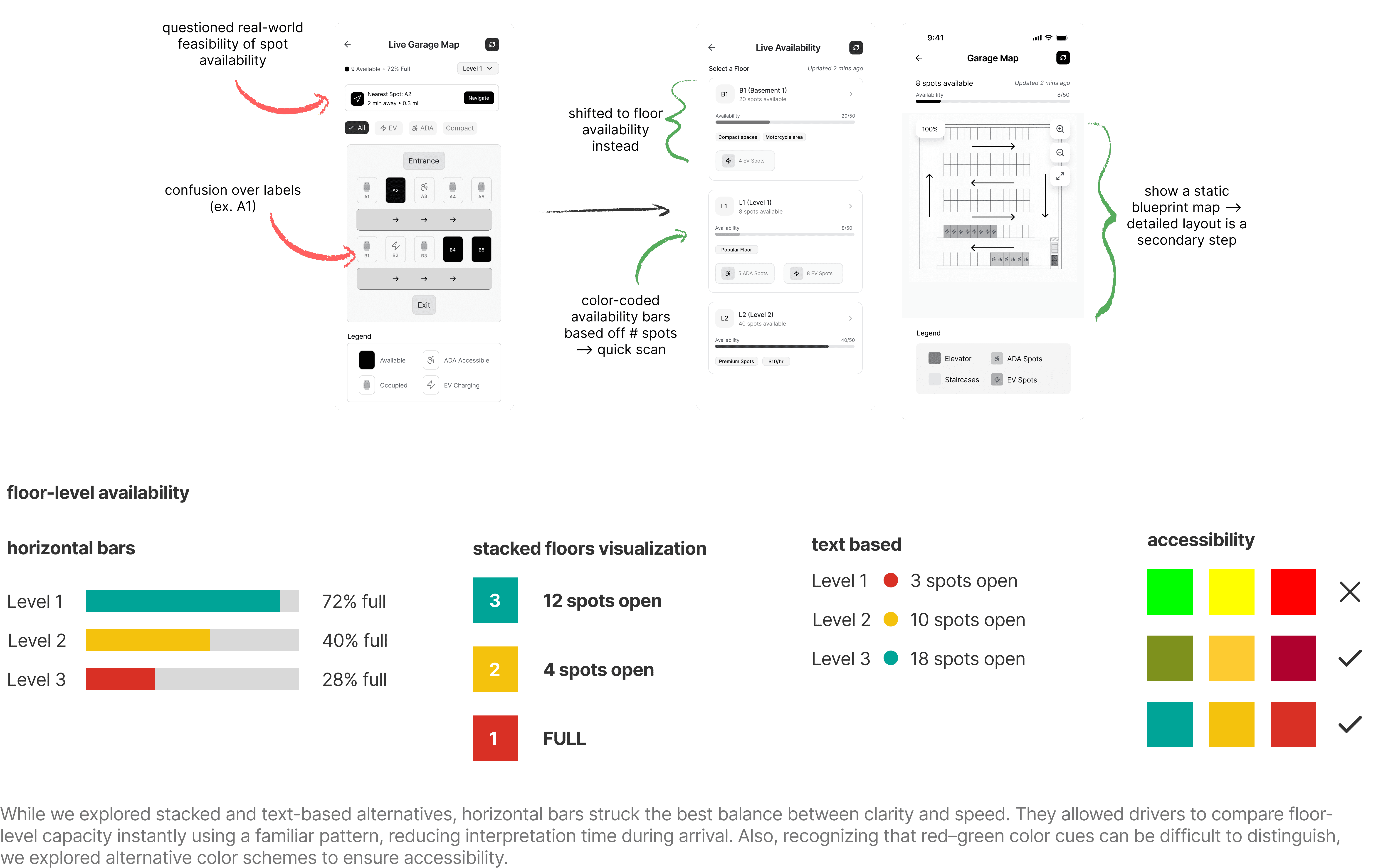
Garage-level occupancy and recommended spots help drivers quickly understand where to go, while a concise Parking Details view brings together distance, walking time, amenities, accessibility, and safety at a glance. Hands-free voice assistance and non-intrusive lock-screen notifications keep drivers informed as conditions change, allowing them to stay focused on the road while remaining confident in their decision.
Guidance Experience
Think-Aloud Sessions
wireframe feedback
Information Clarity & Visualization
Refine how key parking details are visually presented for faster scanning and easier comparison.
Personalization & Adaptivity
Adapt to user habits and preferences to streamline future parking searches.
Accessibility
Improve inclusivity through high-contrast visuals and multimodal feedback such as audio or haptics.
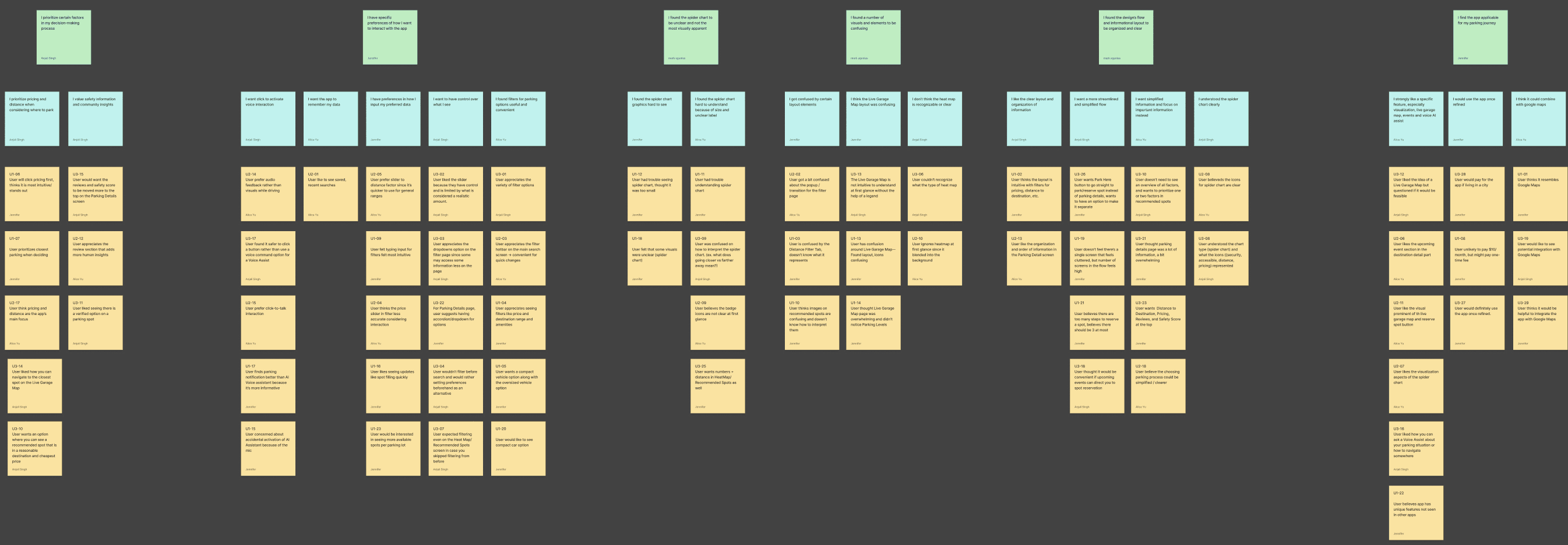
We conducted three sessions with individuals in their 20s with varying levels of parking experience. The findings were:
design iteration
Mid-Fi Wireframes
Evaluations
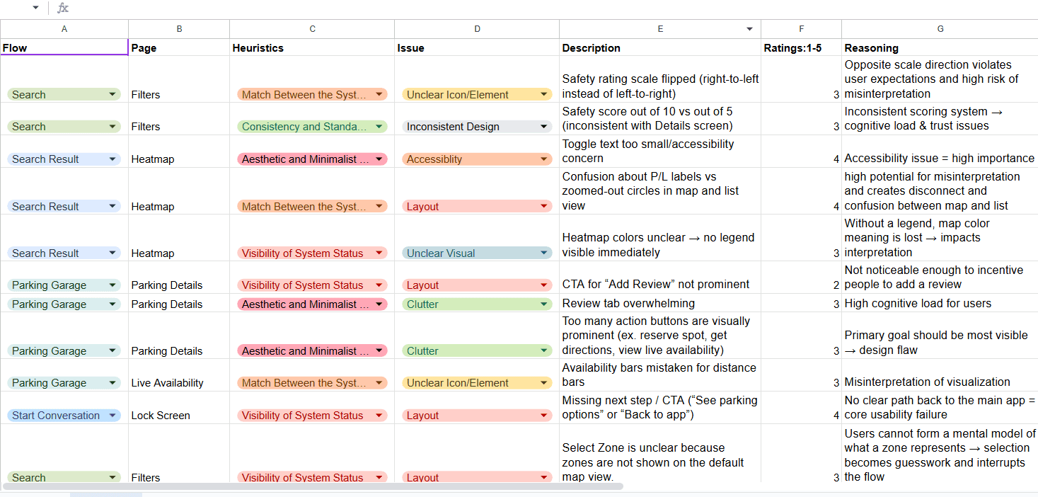
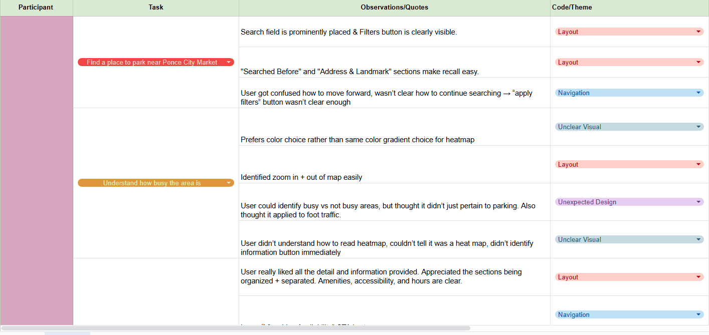
Heuristic Evaluations and Usability Testing
We did the evaluations with 3 UX Designers in the industry, 2 being from ParkMobile, and 4 usability sessions with users.
Thematic Coding
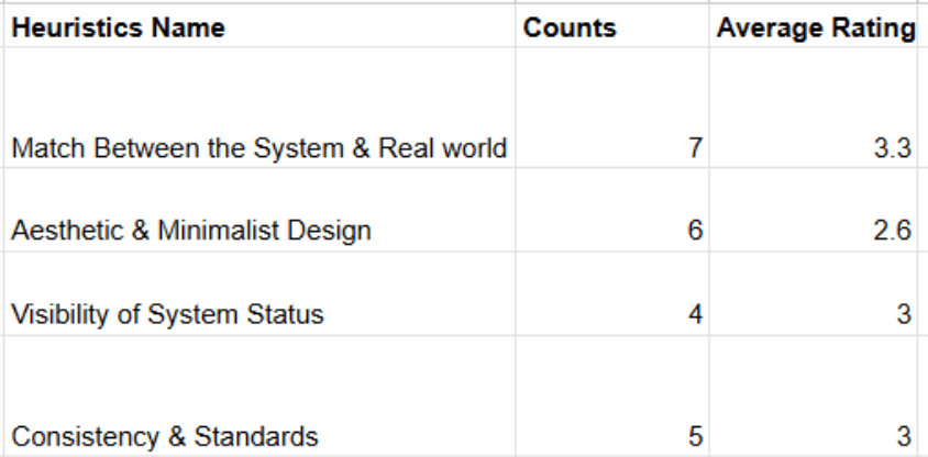
Most Recurring Heuristic Violations
Thematic Coding
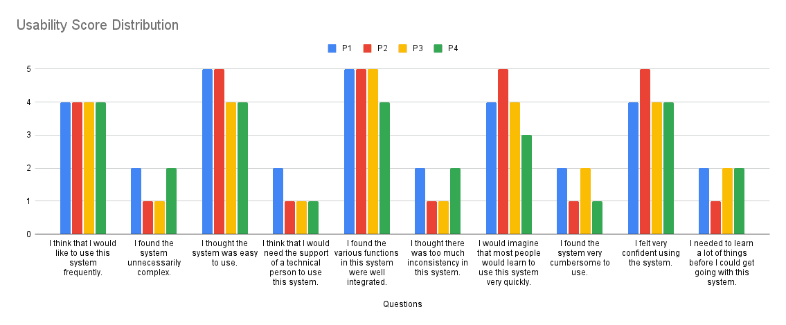
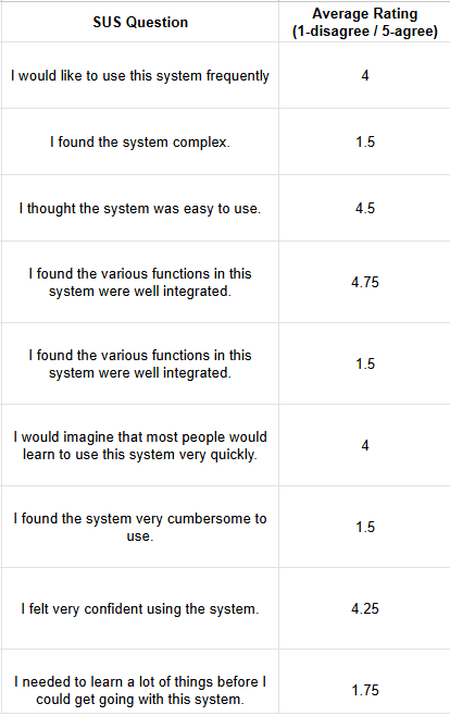
System Usability Scale (SUS)
SUS Ratings
Feedback Sessions
Key findings
What users struggled with
Visual availability indicators are misinterpreted
Key navigation actions are not discoverable enough
Overloaded screens create cognitive pressure
Garage map is misinterpreted as real-time spot availability
Some icons and labels don’t match user mental models
Users expect more predictive and actionable intelligence
design iteration
Hi-Fi Screens

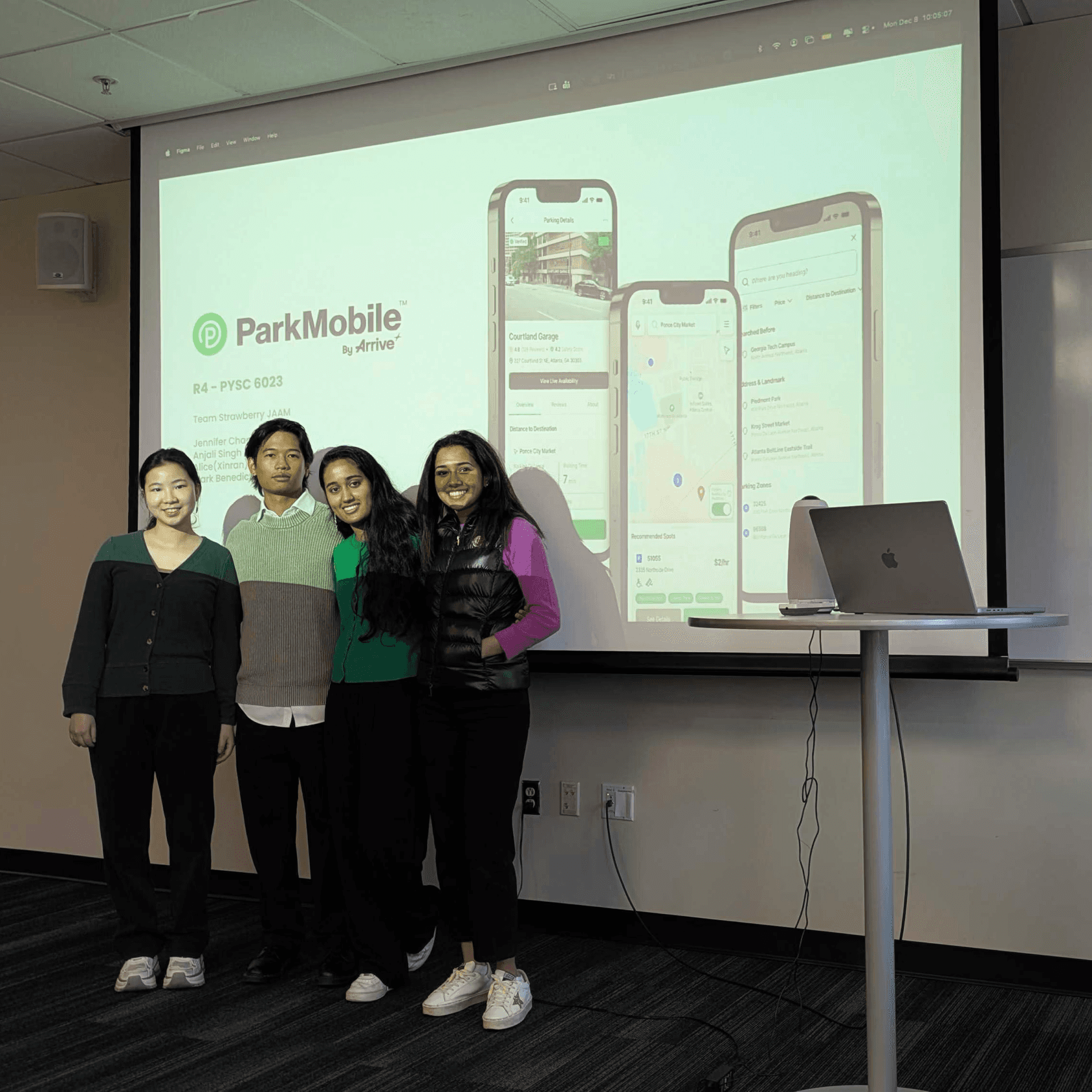
Our final presentation!
reflection
Good design is about what you leave out
This project pushed me to slow down and really think about how much information is too much. As the designs got more detailed, I saw how easy it was to overwhelm users, which forced me to step back and prioritize clarity over completeness. Watching users interact with our work firsthand also changed how I approach usability. Noticing where they paused or hesitated taught me more than any single piece of feedback. I had a great time working with my team, and doing this project reminded me that good design comes from patience and being intentional about what story the interface is telling.


Helping drivers make confident parking choices
Industry Project
UX Research
UX Design

Role
UX Researcher
UX Designer
Timeline
August 2025 - December 2025
TEam
4 MS-HCI Students
1 Arrive UX Researcher
thanks for reading!
resume